Over the past few years, the Wizarding World has grown exponentially with new theme parks and spin-offs like Fantastic Beasts and Cursed Child, captivating fans globally. With this expansive growth, it was only fitting that Pottermore announced a fresh face for J.K. Rowling’s Wizarding World logo. But what’s the source of inspiration for the new emblem? A recent visit to Diagon Alley could hold some clues.

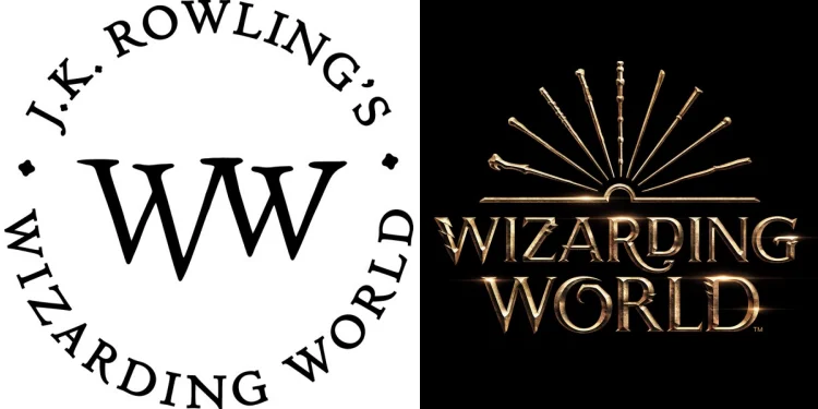
The original logo (left) had a minimalist black and white design, featuring J.K. Rowling’s name circling the words ‘Wizarding World’. You could often spot this logo on the back covers of the new illustrated books and reprints.
The redesigned logo (right) adopts a more visual appeal, replacing Rowling’s name with a collection of nine iconic wands from fan-favorite characters in both Harry Potter and Fantastic Beasts franchises. In order from left to right, we have the wands of Voldemort, Ron Weasley, Hermione Granger, Harry Potter, Albus Dumbledore, Newt Scamander, Tina Goldstein, Queenie Goldstein, and Gellert Grindelwald (the wand he wielded before claiming the Elder Wand). The fresh logo presents the wands in a style reminiscent of an open book, welcoming fans across generations to Rowling’s fantastical universe both in print and beyond.
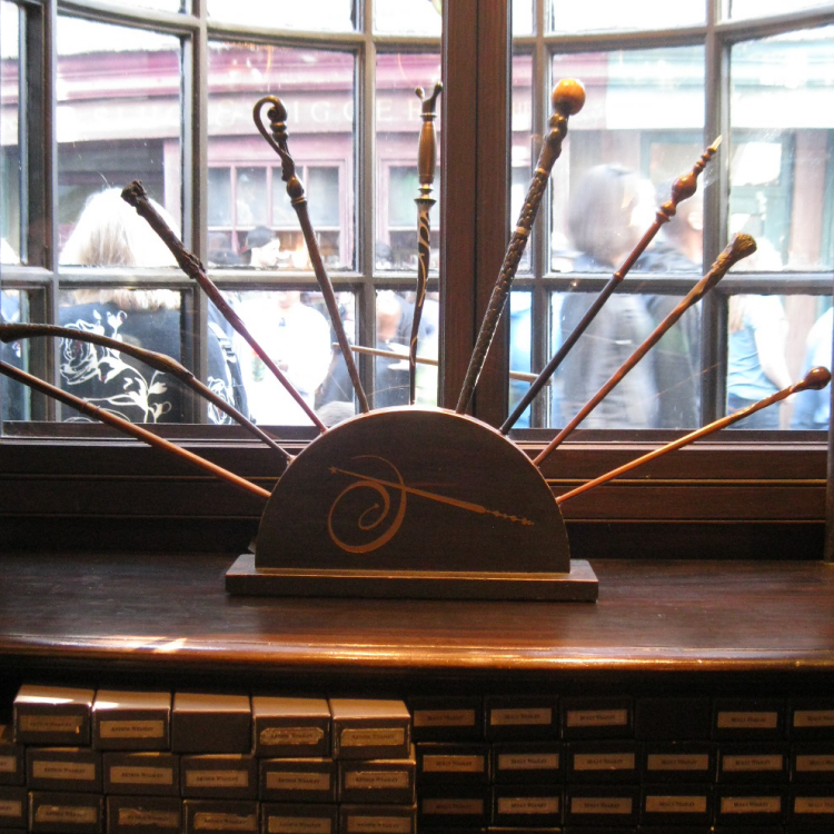

A surprising source of inspiration for this wand-centric design could be none other than the legendary Ollivander’s Wand Shop.
Situated in Diagon Alley within Orlando’s Wizarding World of Harry Potter, a similar wand display (right) occupies a prominent spot in the shop’s window.
There are two minor discrepancies between the logo and the wand display. The wands showcased at Ollivander’s shop include those of Molly Weasley, Bellatrix Lestrange, Harry Potter, Fleur Delacour, Professor Slughorn, Mad Eye Moody, Professor McGonagall, Ron Weasley, and Professor Lupin. Additionally, the wand exhibit lacks the open book illusion present in the logo, requiring a longer horizontal stand at the bottom and removal of the Ollivander shop emblem to achieve that effect.
No official announcement was made regarding the logo’s design inspiration, and while it’s challenging to confirm whether Ollivander’s Wand Shop truly influenced the design, it’s undoubtedly an intriguing point of speculation!